

American Advertising Awards Seattle | 2022 Gold Winner For Magazine Advertising Campaign

Natty Vine Magazine
Art Direction | Branding | Layout | Illustration
Overview
Natty Vine is an independent magazine and brand about organic natural wine. Natty vine is a fun, educational, and playful publication that speaks to new and old wine drinkers. It’s all about community, art, and making wine, something everyone wants to talk about and enjoy.
Roles
Brand development, art direction, illustration, layout, and web design.
Tools
InDesign, Photoshop, Illustrator. Photoshop, XD, Figma, and Procreate.
Timeframe
12 Weeks. September 2021-December 2021
Challenge
There are many other magazines about natural wine online and in print, but there is a space missing for a creative, young, yet refined magazine about natural wine. The market needs fresh eyes on what defines natural wine and the audience to which it appeals. Our challenge is to fill the gap in the market and create a vibrant, young magazine that speaks to people in their 20s to 40s and attracts both educated wine consumers to new organic wine drinkers.
Solution
A lot of people feel intimidated by wine. At Natty Vine, we want to strip away stereotypes and create something playful that would help demystify natural wine. We want to inspire people to try new things, so each magazine is filled with our personal wine favorites and local areas where people can go and explore natural wine. We feature the communities within our featured city and showcase a featured artist. We want to encourage people to see the winemakers in our magazine.
Research and Demographic
When beginning this process of creating Natty Vine, I explored other natural wine magazines on the market today and the consumers they were attracting. During this research phase, I looked over what sets other magazines apart from the leading competitors and found a unique need for the natural wine magazine market. I established what the magazine needed and what was not during this stage. Our primary audience of users is aged 25-45. These consumers may be new to natural wine, but they are confident, fun, and curious about knowing more about natural wine.


Process
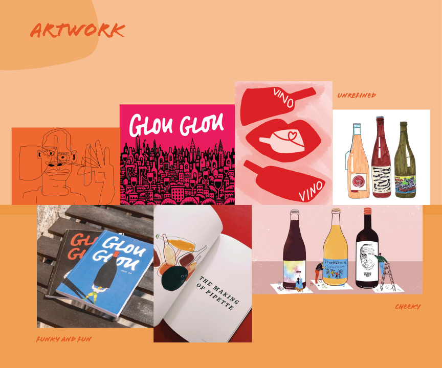
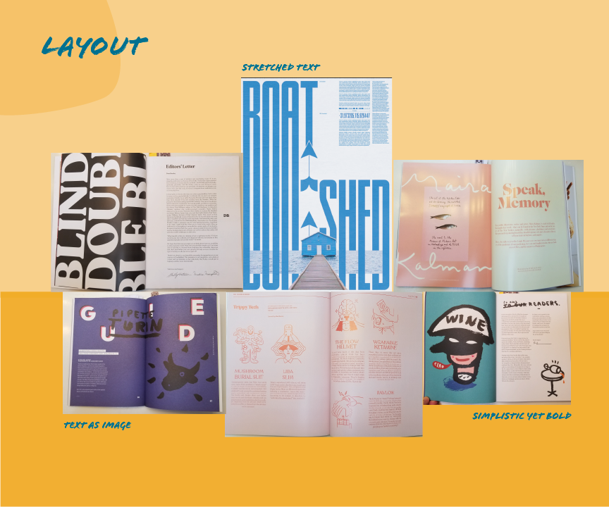
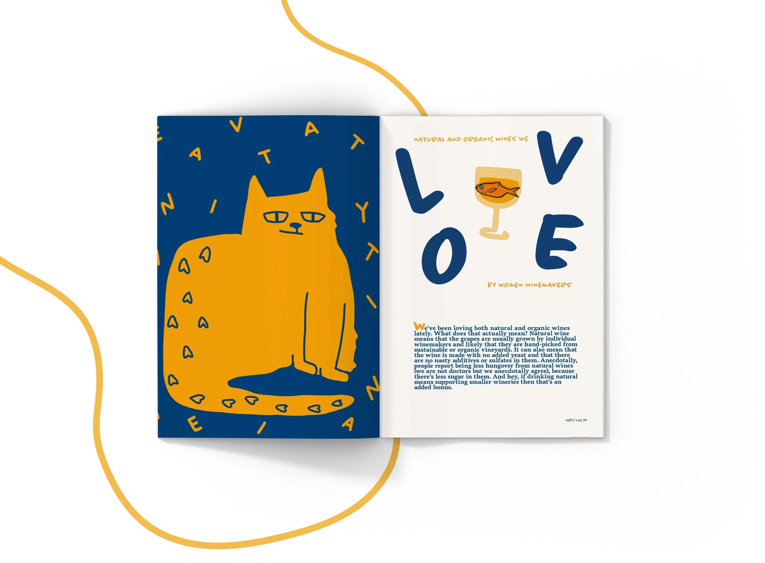
Bright, humanistic, and simplistic. The layout structure is bold, using type and imagery to catch the reader’s eye and get them to look deeper into the page. With large text, layering, and strong imagery, the style of each page is distinctive and expresses the subject of the magazine’s features. I created moodboard recipes for photography, artwork, layout, and illustration to keep Natty Vine’s visual design cohesive throughout our magazine.


Magazine Brand & Illustration Sketching Exploration
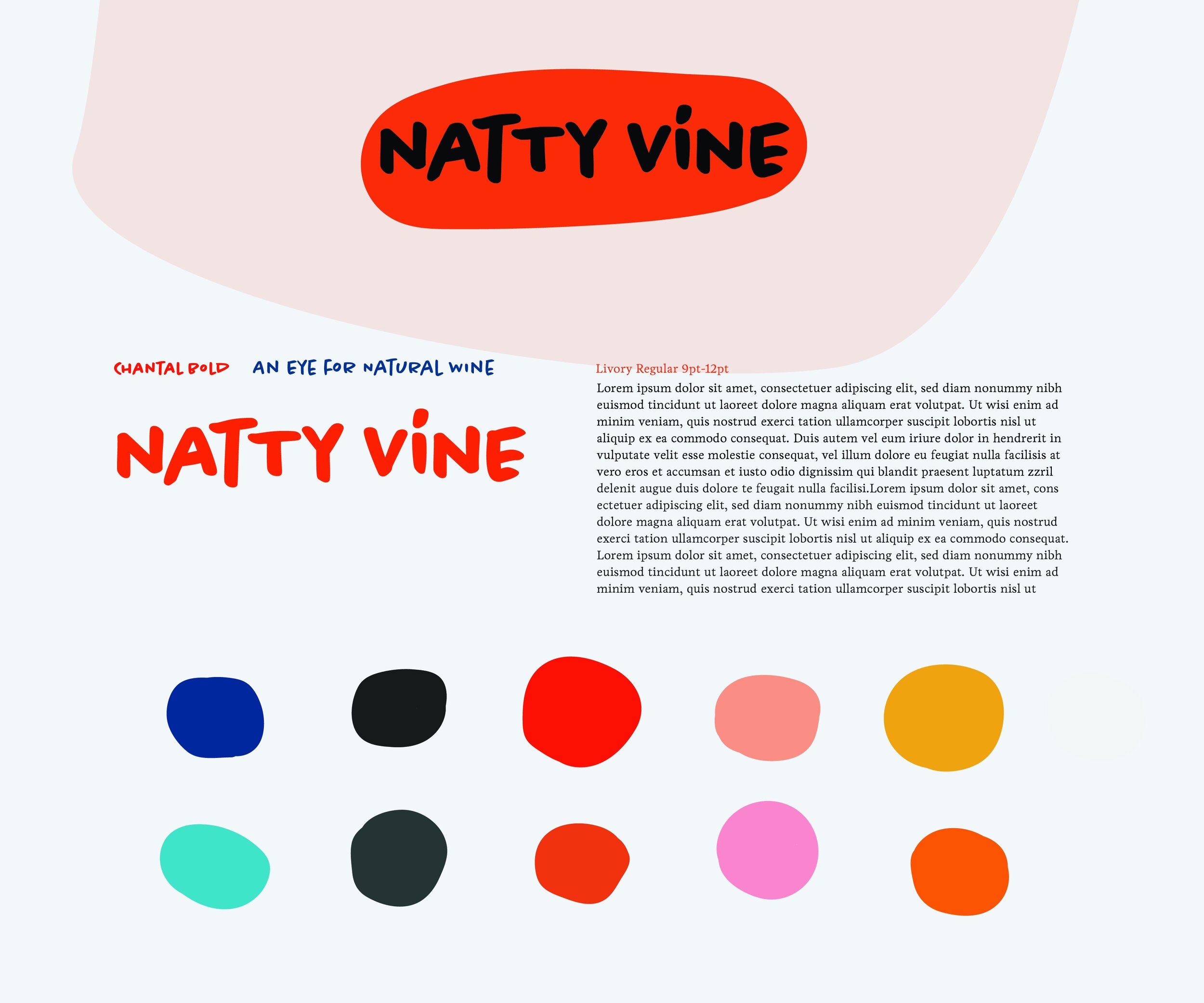
Logo
In keeping the brand's promise of an approachable and fun magazine, the logo Is inspired by its source. Using a slightly humanistic font and utilizing organic shapes to create a logo that speaks behind the brand. Our logo has color variations to express the logo further
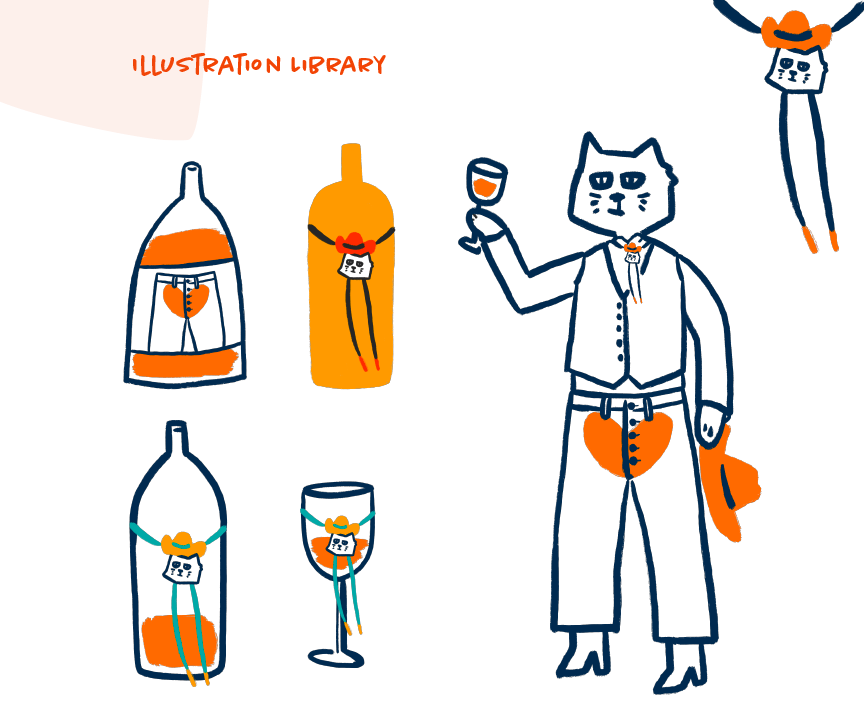
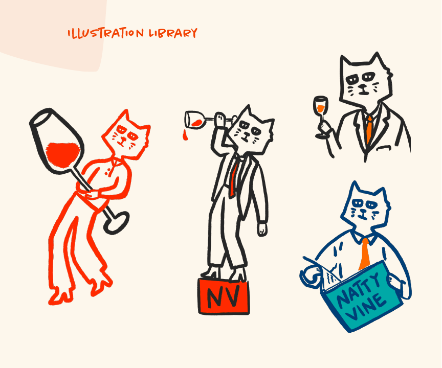
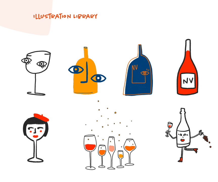
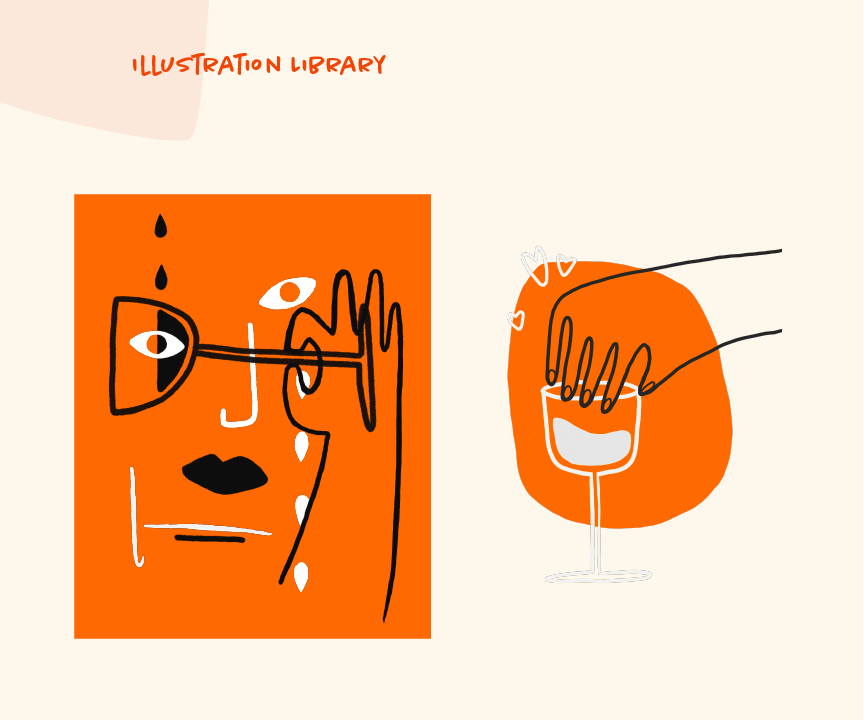
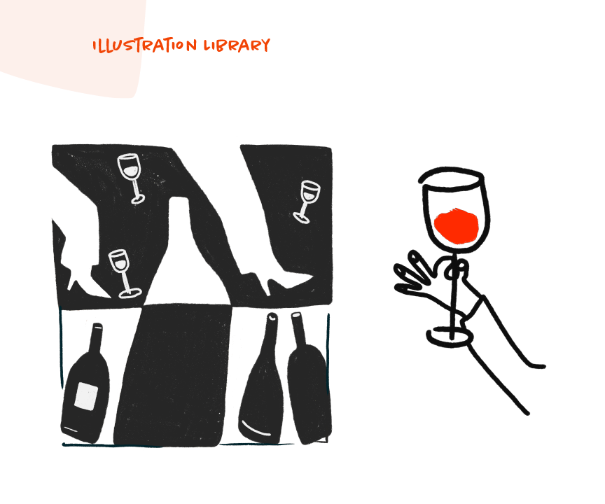
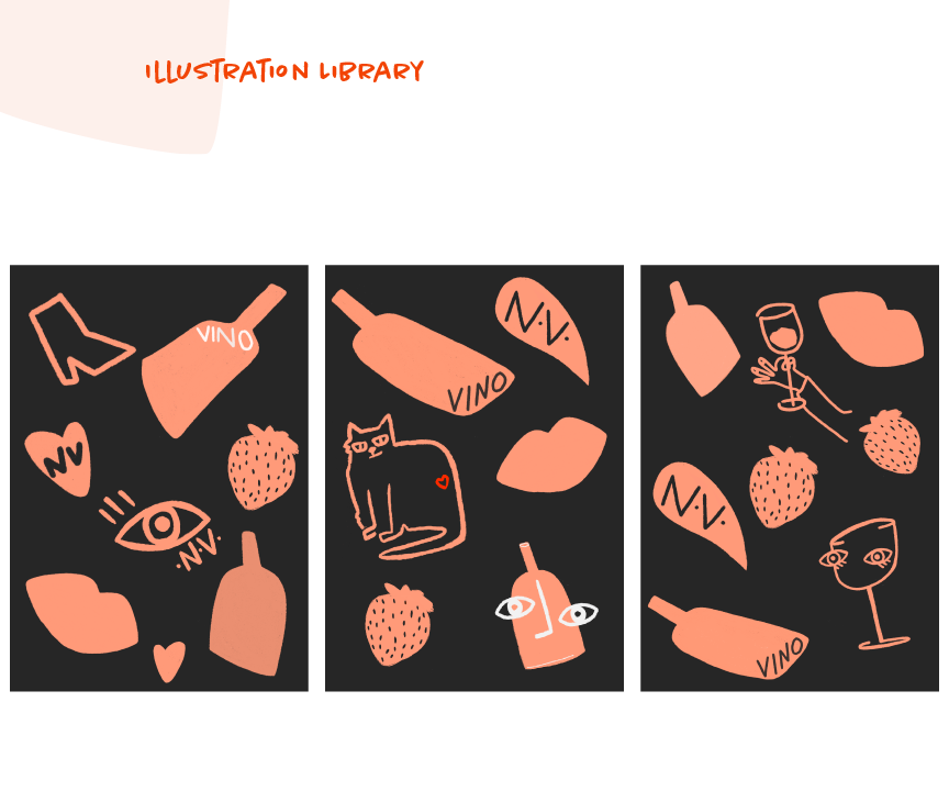
Illustrations
Reflecting the magazine's tone, I created illustrations and graphic elements that are playful, unrefined, and experimental. This is achieved in the graphics below by using bold blocks of color while utilizing type and showing viewers a light side that is approachable, thus sparking interest.


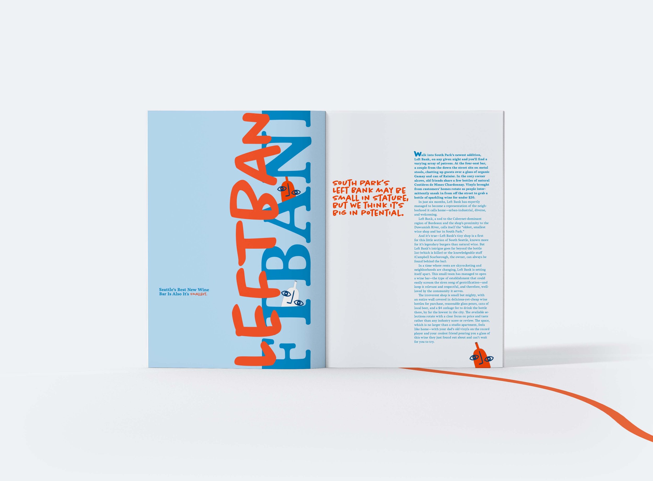
The Magazine
Natty Vine opens your eyes to natural wine through a quirky, approachable perspective. We publish top-quality journalism alongside unique illustrations and photography.


Web Design

American Advertising Awards Seattle | 2022 Gold Winner For Magazine Advertising Campaign