Florese Premium Cannabis
Branding | Art Direction | Packaging
Roles
Brand development
Art Direction
Layout
Packaging System
Tools
Indesign
Photoshop
Dimension
AfterEffects
Overview
Florese is a cannabis brand with top-quality products. This project aimed to create multiple approachable, easy, and informative products for consumers.
Deliverables
Brand identity, Packaging system, logo system, marketing materials
Timeline
Nine Weeks | January 2022-March 2022
Challenge
The Cannabis industry is riddled with many inconsistencies in names, labels, and language, not to mention the social stigma of being a cannabis user. As a result, buying cannabis can feel overwhelming and complicated. How might we make trying new cannabis easy, enjoyable and educational for consumers of varying knowledge levels?
Solution
Our goal was to develop and brand a cannabis product that removes the burden of choosing cannabis, allowing our consumers to learn about cannabis in a fun way that makes exploring new cannabis transparent and easy for our customers.
Concept
Standing out from its competitors, Florese celebrates the source of its ingredients and the impact it takes on our planet. We offer organic, sustainable, and discrete products that we firmly stand by. We care about how our products process from the growing to the packaging; we believe quality and sustainability are not a compromise but a must.
Visual Design
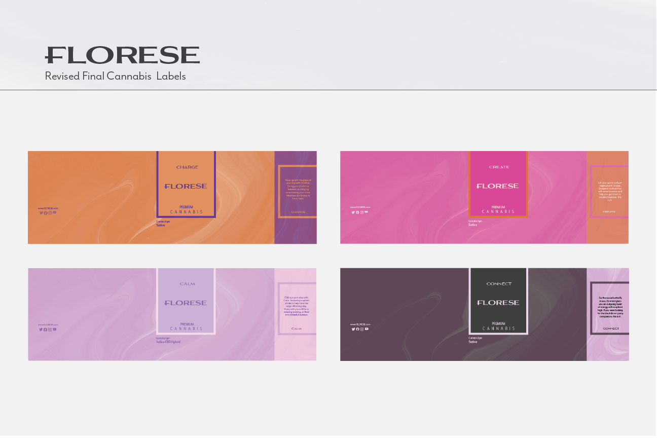
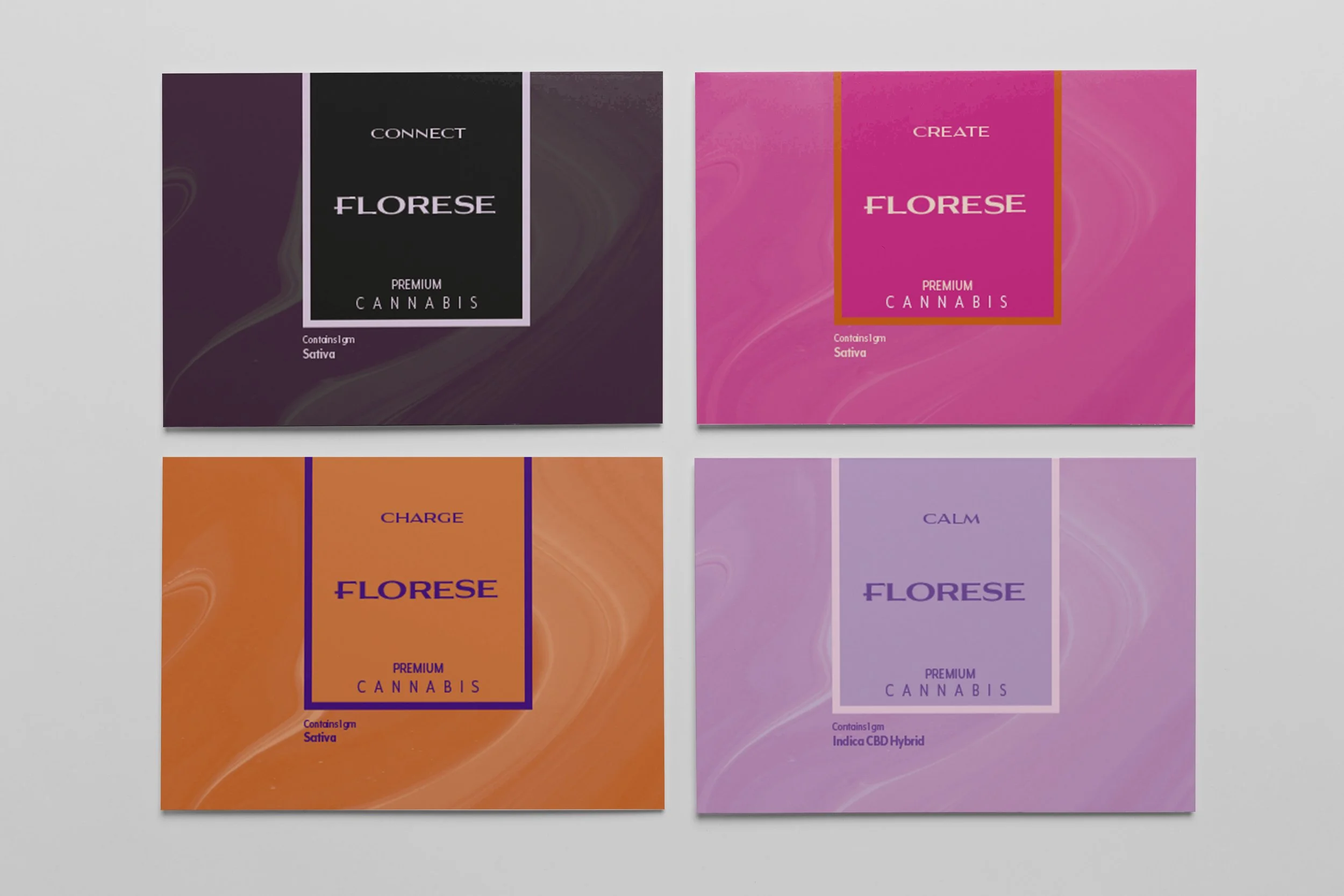
Florese visual identity represents a fusion of two styles- a clean, minimalist look mixed with blocks of color. The brand’s color palette is bright and soothing, with soft movements in the graphics to give a visual feel for the brand products. The color palette is vibrant and harmonious so that our products stand out individually yet are collaborative side by side.
Our Logo
We wanted to create a logo representing our brand's simplicity and cleanliness. Our logo speaks to our brand and how we want our users to feel when buying our products.
About Us
Packaging & Label Design


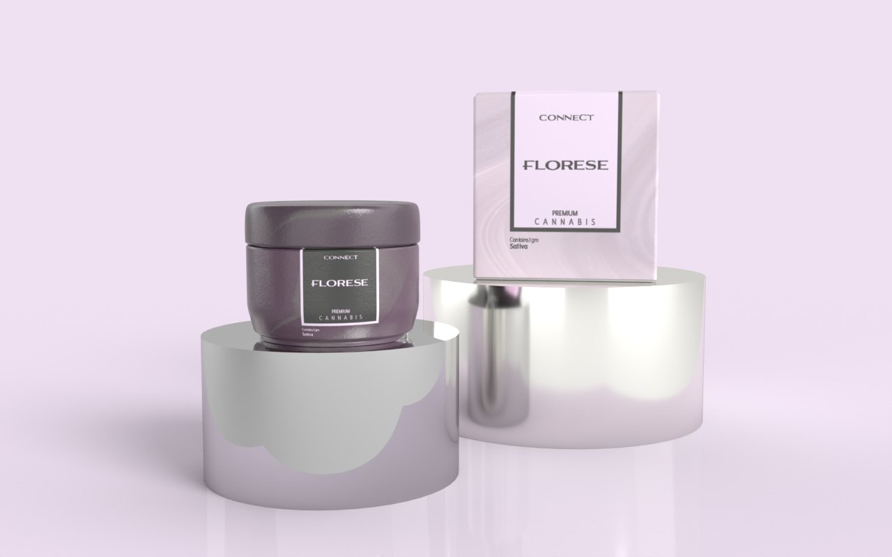
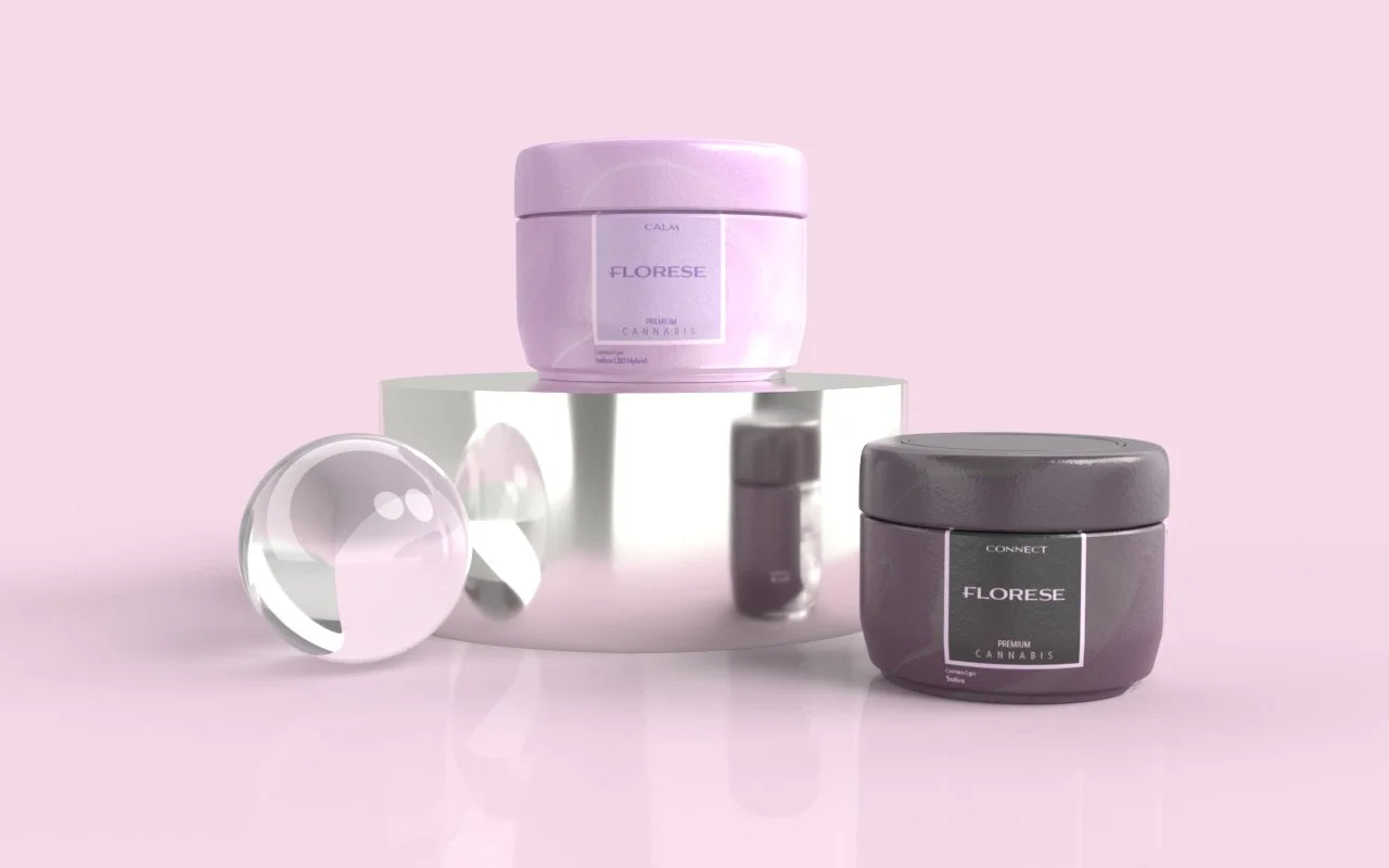
Our Packaging


